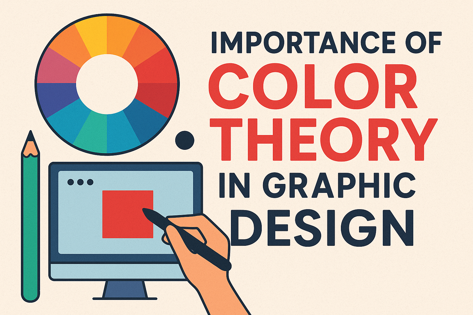
Have you ever noticed how some designs grab your attention even before you read a single word? That’s the magic of color. The right color combination can make a brand instantly recognizable and memorable, while the wrong colors can leave people feeling confused. Color isn’t just decoration, it’s a language that speaks to our emotions and tells us what the brand is all about.
In the world of visual creativity, the importance of color theory in graphic design cannot be overstated. It grabs attention, sets emotions, and helps people understand the message behind a design. Color theory allows designers to create harmony, balance, and meaning in their visuals. Without understanding it, even the most creative artwork can fail to connect with its audience.
In this article, you will get to know the importance of color theory in graphic design, the color wheel, color combinations, and color psychology.
Table of Contents
What is Color Theory?
Color theory is the study of how colors work together. It explains how colors mix, match, and contrast with one another to create visually appealing designs. In graphic design, it serves as a roadmap for choosing color combinations that communicate the right message and connect with the audience. The importance of color theory in graphic design lies in its ability to transform simple visuals into powerful tools of communication.
What is Color Wheel?
The color wheel is the foundation of color theory. It is a circular chart that shows how colors are related to one another. Designers use it to understand color relationships and create harmonious color schemes. The traditional color wheel has 12 colors, divided into three groups: Primary colors, Secondary colors and Tertiary colors.
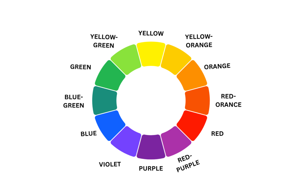
- Primary Colors: These are the base colors that cannot be made by mixing others. Red, blue, and yellow.
- Secondary Colors: Made by mixing primary colors. Green, orange and purple.
- Tertiary Colors: Made by mixing primary and secondary colors. Yellow-green, yellow-orange, red-orange, red-violet, blue-violet, and blue-green.
What are the 7 Types of Color Theory with Example
Designers use color theory to create harmony, balance, and visual appeal in their work. These different types of color theory are based on the color wheel and help determine which colors look best together.
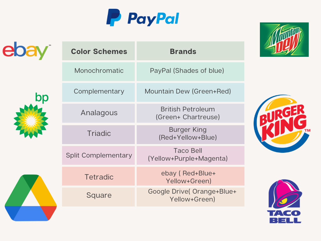
Monochromatic: Variation of a single color
A monochromatic scheme focuses on one base color and uses its different tints, tones, and shades. Because it stays within the same hue, it’s simple, elegant, and almost impossible to get wrong. This approach works well for clean, minimal designs where consistency and simplicity are key.
Example: Light blue, sky blue, and navy blue.
Analogous – Neighboring Colors on the Wheel
Analogous color schemes use hues that sit next to each other on the color wheel. These combinations naturally feel balanced and pleasing to the eye, making them perfect for designs that don’t require strong contrast, such as backgrounds, nature-inspired themes, or soft gradients.
Example: Green, yellow-green, and yellow.
Complementary – Opposite Colors for Contrast
The complementary color scheme pairs colors that lie directly opposite each other on the wheel. This creates bold, high-contrast visuals that grab attention. It’s often used to make key elements stand out—like using an orange button on a blue background.
Example: Blue and orange, or red and green.
Split-Complementary – A Softer Contrast
This scheme starts with one base color and pairs it with the two colors beside its opposite on the color wheel. It offers contrast like the complementary scheme but with a more balanced and less intense feel. It’s great for colorful designs that still maintain harmony.
Example: Blue, yellow-orange, and red-orange
Triadic – Three Colors Evenly Spaced
The triadic scheme uses three colors evenly spaced around the color wheel. This setup creates lively and dynamic combinations while staying visually balanced. To make it work best, choose one color as the main tone and use the other two as accents.
Example: Red, yellow, and blue.
Tetradic (Double Complementary) – Two Color Pairs
A tetradic scheme includes two complementary color pairs, forming a rectangle on the color wheel. It offers a wide range of color possibilities, balancing both warm and cool tones. Because it involves four hues, careful control is needed to keep the design cohesive and not overwhelming.
Example: Blue and orange with green and red.
Square – Four Evenly Spaced Colors
Similar to the tetradic scheme, the square color scheme uses four colors equally spaced around the wheel, forming a square shape. This method provides variety and vibrancy while maintaining harmony when used with balance.
Example: Blue, orange, yellow, and violet.
Hue, Tint, Tone, Shade, and Saturation Explained
Understanding hue, tint, tone, shade, and saturation is essential for every designer. These terms describe how colors change in appearance from light to dark or bright to dull. Knowing the difference between them helps you create balance, mood, and depth in your designs.
What Is Hue in Color?
A hue is the purest form of a color like red, blue, yellow, or green. It’s the base color you see on the color wheel, without any white, black, or gray added.
Example: Red is a hue, and when you change it by adding white or black, it becomes a tint or shade.
Tint (Adding White to a Hue)
A tint is created by adding white to a hue. This makes the color look lighter, softer, and more pastel.
Example: When you add white to red, it becomes pink.
Shade (Adding Black to a Hue)
A shade is made by adding black to a hue. It gives the color a darker, deeper, and more dramatic look.
Example: Adding black to blue makes navy blue.
Tone (Adding Gray to a Hue)
A tone happens when you add gray (a mix of white and black) to a hue. This reduces the color’s brightness and makes it look more natural or muted.
Example: Olive green is a toned version of bright green.
Saturation
Saturation refers to how pure, bright, or intense a color appears.
- High saturation: A high saturation color looks bold, vivid, and eye-catching (like a bright red or neon green). For example: Fresh red apple.
- Low saturation : A low saturation color looks soft, dull, or grayish (like faded blue or dusty pink). For example: A red apple photo that’s faded in sunlight.
In design, adjusting saturation helps you create mood. Bright colors feel energetic, while desaturated tones feel calm and professional.
Hue, Tint, Tone, Shade, and Saturation Difference
| Hue | Pure Color |
| Tint | Hue+ White |
| Shade | Hue+Black |
| Tone | Hue+Gray |
| Saturation | How vivid or dull the color looks |
By learning the difference between hue, tint, tone, shade, and saturation, designers can control the emotional feel of their work, making it look lively, elegant, or calm with just small changes in color.
The Psychology of Color and Temperature
Colors are more than just visuals, they can make us feel something. The psychology of color and temperature explains how colors can create warmth, coolness, or certain emotions in our minds.
Colors are often divided into warm and cool tones. Warm colors like red, orange, and yellow remind us of sunlight, fire, and energy. They make spaces feel cozy, exciting, or even passionate. That’s why restaurants often use warm tones, they create a lively and welcoming mood.
On the other hand, cool colors like blue, green, and purple are linked with water, sky, and calmness. They bring feelings of relaxation, peace, and balance. Designers use cool colors in offices, hospitals, or bedrooms to create a calm and focused environment.
Color temperature doesn’t only affect emotions, it also changes how we perceive space. Warm colors can make a room feel smaller and inviting, while cool colors make it feel larger and more open. Understanding the psychology of color and temperature helps designers, artists, and marketers connect with people on an emotional level, turning simple colors into powerful storytelling tools.
Psychological meanings of some common colors
| RED | Energy, passion, danger, or excitement |
| ORANGE | Confidence, success, bravery, and socialism |
| YELLOW | Happiness, optimism, and creativity |
| GREEN | Growth, nature, and health |
| BLUE | Trust, peace, calmness, and intelligence |
| PINK | Sincerity |
| PURPLE | Luxury, mystery, and creativity |
| BLACK | Power, elegance, or mystery |
How Designers Use Color Theory in Real Projects
Designers apply color theory in every part of their creative process. Here’s how:
| Branding | To choose a color palette that reflects the company’s values. |
| Web design | To create user-friendly interfaces and highlight important actions. |
| Advertising | To evoke emotions and influence buying behavior |
| Packaging | To make products stand out on shelves |
| Social media | To maintain visual consistency and brand recall |
For example:
A children’s toy brand may use bright, saturated colors to appear fun and exciting.
A luxury perfume brand may use muted tones and gold to show elegance.
Frequently Asked Questions (FAQ)
What is the aim of the color wheel?
The color wheel is a visual tool that helps designers understand relationships between colors. Color wheel helps designer pick colors that look good together.
Which color shows kindness?
Soft, warm colors like pink, light yellow, and pastel blue are often associated with kindness and compassion.
What is the 60-30-10 color rule in graphic design?
The 60-30-10 rule is a simple design formula that ensures color balance. Use 60% of a dominant color (background), 30% of a secondary color (supporting elements), and 10% of an accent color (for emphasis). This rule keeps your design clean, professional, and visually engaging.
How do you select color palettes for your projects?
When selecting a color palette, start by understanding the brand’s message and target audience. Use tools like the Canva Color Wheel or Adobe Color to explore harmonious combinations.
Conclusion
Understanding color theory is one of the most essential skills for any designer. It bridges the gap between creativity and communication. The importance of color theory in graphic design lies in its power to make visuals more meaningful, consistent, and persuasive.
By understanding concepts like the color wheel, color harmony, the 60-30-10 rule, and color psychology, designers can influence how people perceive and react to their work. Whether it is a brand logo, a website layout, or a poster design, using the right color combinations can turn simple visuals into unforgettable experiences. This knowledge is especially valuable for those exploring opportunities like how to become a freelance logo designer.