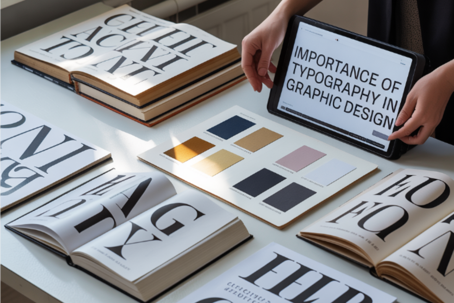
Typography is all around us, from books and websites to street signs, product packaging, and everyday life. More than just choosing fonts, it’s an essential component of design that communicates mood, tone, and personality. In this article, you will know the importance of typography in graphic design, including typeface in graphic design, types of typography in graphic design, typography fonts, and concepts like what is kerning and leading in typography to create compelling and readable visuals.
Table of Contents
What is Typography in Graphic Design?
Typography in graphic design is the art and technique of arranging letters to make them visually appealing, readable, and effective in communicating a message. It involves selecting the right typefaces, adjusting typography fonts, and managing spacing elements such as kerning, leading, and tracking.
Typography isn’t just about picking pretty letters, it’s a powerful tool in graphic design. It helps establish hierarchy, set the tone, and convey a brand’s personality across digital and print designs.
Importance of Typography in Graphic Design
Effective Communication: Good typography can speak volumes, conveying emotions and guiding readers effortlessly through the content.
Aesthetic Appeal: Well-chosen typography can significantly enhance visual allure, making your designs eye-catching and memorable.
Professionalism: Quality typography distinguishes good design from amateur attempts, lending a polished look to your work.
Typeface in Typography
A typeface in typography is defined by its unique design elements characteristics like curves, line weights, and widths that make it distinct. Each typeface conveys a unique personality.
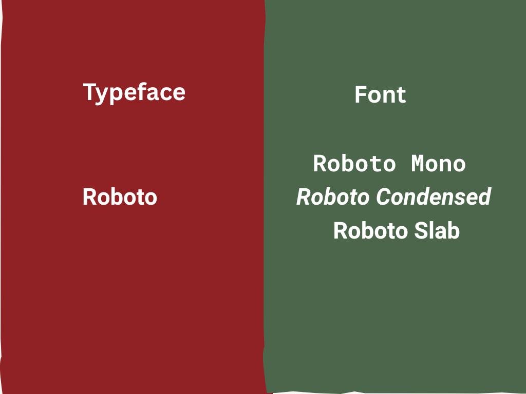
| Typeface | Font |
| The overall design or style of a set of letters, numbers, and symbols | A specific version or variation of a typeface (like bold, italic, or size) |
| Helvetica | Member of typeface (Helvetica regular, Helvetica oblique) |
Key Typography Principles in Graphic Design
When it comes to the fundamentals of typography in graphic design, certain principles are vital in getting it right.
Importance of Font Choice
Choosing the right font is akin to selecting the right outfit, it’s all about context and style. Scrutinizing each font’s attributes ensures that your design not just looks great, but communicates effectively too. It’s important to use the right font at the right time. For example, using Comic Sans for a legal document might send the wrong message. Similarly, using a playful handwritten font for a corporate presentation can look unprofessional, while using a bold display font in a long paragraph can make the text hard to read.
Legibility, Hierarchy and Readability
Readability is about how easy it is to read words, sentences and paragraphs, while legibility refers to how clear individual characters are.
Balance and Layout Considerations
Creating a visually balanced layout involves meticulous planning of spacing and text distribution.
Visual Hierarchy in Typography
Visual hierarchy in typography is how text is arranged to show which parts of the content are most important. It helps readers easily scan and understand information by guiding their eyes in a specific order. For example, a large bold heading grabs attention first, subheadings provide structure, and smaller body text delivers details.
Good visual hierarchy ensures that the message is clear and easy to follow, while poor hierarchy can make a design look confusing or cluttered. In typography, it’s all about making sure the most important words stand out, and the design feels balanced and readable.
Kerning, Tracking, and Leading in Typography
When it comes to typography, three essential concepts – kerning, tracking, and leading – play a vital role in ensuring that text is not just readable, but also visually appealing. Let’s break each of these down!
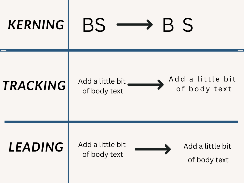
– Kerning refers to adjusting the space between individual letter pairs to ensure consistency and harmony.
– Tracking : Tracking in typography refers to the overall spacing between all the letters in a block of text. It affects how tight or loose the text looks across an entire word, sentence, or paragraph. Increasing tracking adds more space between letters, making text feel airy and open, while decreasing tracking tightens the letters, creating a more compact look.
– Leading is all about the vertical space between lines of text, ensuring your message doesn’t feel crowded or stretched.
Harnessing these typography principles affects the flow and aesthetic balance in graphic design, ensuring that your creations are more than just eye-catching—they’re impactful.
Common Typography Mistakes in Design
Typography is an essential element of graphic design, and when done right, it can enhance and elevate your project. But like any powerful tool, it can also go horribly wrong. Let’s explore some common typography mistakes that you should avoid.
Overuse of Fonts
One of the most frequent errors designers make is the overuse of fonts. It’s easy to get excited about the myriad of typefaces available, but mixing too many fonts can lead to a messy and confusing design. Generally, it’s best to stick to a maximum of two or three fonts in a single project. This helps to maintain a cohesive and harmonious look. When choosing your fonts, consider their roles: One for headlines, another for body text, and perhaps a third for special elements. Simplicity often leads to more effective communication.
Ignoring Readability Factors
Readability is king when it comes to typography in graphic design. If your audience struggles to read your text, your message could get lost, no matter how fantastic your design might be. Avoiding cluttered layouts, choosing legible fonts, and considering the text size are all crucial steps. Don’t forget the importance of color contrast; light colors on a dark background or vice versa can enhance readability. Also, consider spacing, give your text room to breathe with appropriate line height and letter spacing.
Mismatched Typeface Combinations
Mixing typefaces can add depth to your design, but only if done with careful consideration. Mismatched typefaces can create visual tension and convey conflicting messages. Aim for contrast without conflict.
Strategies for Effective Typography
With the right approach, typography can significantly enhance your design and strengthen your brand’s message.
Selecting the Right Typeface for Your Brand
When you are selecting typeface for your branding, consider the message you want to convey to your target audience. A sleek, modern typeface may work well for a tech company, while a whimsical, hand-drawn font might fit better for a creative studio. Spend time understanding the personality of various typefaces and how they can support the perception of your brand.
Implementing Consistent Typography Styles
Consistency in typography not only helps establish your brand identity but also enhances user experience. Make sure to use the same fonts, sizes, and styles across all your designs. This doesn’t mean every piece should look identical, rather, aim for a unified presentation that makes your audience instantly recognize your brand. Establishing a style guide can help keep your typography consistent across different mediums.
Types of Typography in Graphic Design
When it comes to graphic design, choosing the right type of typography can make all the difference. Typography sets the tone and communicates your message effectively. Let’s dive into the main types of typography and understand how they play their role in the world of design.
| FONTS | USE IN | EMOTIONS | NOTE |
| SERIF | Financial companies, fashion brand, editorial (magazine and newspaper) | Official, serious, classy, elegance, luxury | Zara, Rolex, Volvo |
| SANS-SERIF | Start up, technology brand, sports and modern brand | This style is straight-forward. More clean and modern Easy to read | Google, Microsoft, LinkedIn |
| HANDWRITING OR SCRIPT FONT | Instagram, happy anniversary card | Soft, love, makeup | Decorative and calligraphic in nature |
Conclusion
In this article, I tried to explain the importance of typography in graphic design and how it influences readability, mood, and overall visual appeal. Typography is the silent element that can either strengthen or weaken your message. Embracing good typography means choosing the right fonts, spacing, and hierarchy to communicate effectively. So, the next time you create a design, remember typography can transform a simple layout into a powerful visual story.
Typography and color often work hand in hand, so check out our article on the importance of color theory in graphic design to see how color choices can enhance your designs.
Typography works best when guided by solid design fundamentals, explore design principles in graphic design to learn more.